activation_probability <- function(antigen, K, n) {
  (antigen^n) / (K^n + antigen^n)
}Introduction
The Immunological Challenge
Let’s face it, the immune system is a bit of a drama queen (or king, depending on the situation). It’s constantly patrolling our bodies, acting as a vigilant security force, looking for trouble (like invading pathogens, damaged cells, or rogue cancer cells). When it finds something suspicious, it initiates a complex and tightly regulated immune response (a carefully orchestrated), multi-cellular reaction of activation, proliferation, differentiation, and effector functions (like killing infected cells). It’s not just a party; it’s a meticulously planned military operation. But like any complex system, things can go wrong.
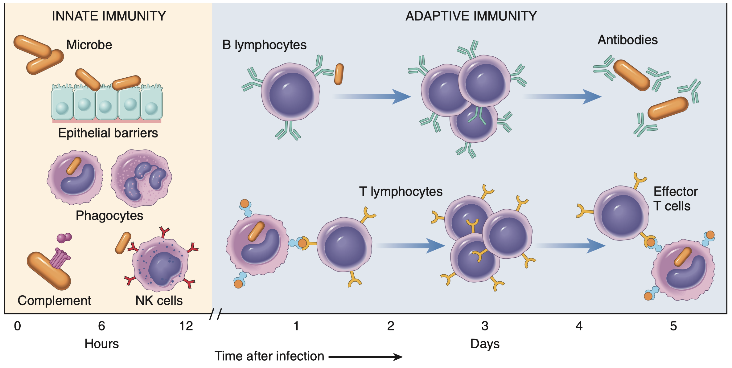
Take cancer immunotherapy, for example. These therapies, like immune checkpoint blockade, aim to harness and enhance the immune system’s natural ability to fight cancer. The basic idea behind checkpoint blockade is to block inhibitory signals (immune checkpoints) that tumors exploit to evade immune destruction (Liu et al. 2022). These checkpoints are crucial for preventing autoimmunity (the immune system attacking the body’s own tissues), but tumors hijack them to create an immunosuppressive microenvironment (Chang et al. 2015). By blocking these checkpoints, the “brakes” on anti-tumor immunity are released, allowing T cells (and other immune cells) to attack the cancer cells more effectively. Sounds simple in theory, right?
Well, not quite. Predicting who will respond to these therapies and who won’t is a significant challenge in the field of immuno-oncology. Why? Because the interactions between tumor cells and immune cells (especially lymphocytes, which include T cells and other important players like NK cells) are incredibly complex and context-dependent. It’s not just about counting the number of T cells present in a tumor (although that’s important); it’s about understanding their dynamic behavior: how they traffic to the tumor, how they get activated within the tumor microenvironment, how they interact with tumor cells (e.g., recognizing tumor-associated antigens), how they interact with other immune cells (both promoting and suppressing the immune response), and how they eventually either effectively eliminate the tumor or become exhausted (losing their effector functions). It’s a dynamic and multifaceted system, not a static snapshot (Taefehshokr et al. 2022).
Because Straight Lines are for Geometry, Not Biology
Traditional methods of studying the immune system, like taking a single blood sample and counting cell types (a bit like taking a census of a bustling city at one specific time), are useful for getting a basic snapshot. They tell us who is present, but not what they are doing. Similar to taking a single still photograph of a bustling city, you might see how many buildings and people are there, but you’d miss all the action, the traffic jams, the hustle and bustle of people going about their day, the dynamic flow of life. You’d miss the whole story.
Biological systems, especially complex ones like the immune system, rarely behave in a linear, predictable fashion. A small change in one factor (say, a slight increase in the concentration of a signaling molecule) can have a huge, disproportionate, and often unexpected effect on the overall response. 
The first reason is feedback loops. These are like the thermostats of biological systems. A positive feedback loop amplifies a signal (like a snowball rolling downhill, getting bigger and bigger), while a negative feedback loop dampens a signal (like a thermostat turning off the heating when the desired temperature is reached). These feedback loops create complex, dynamic behaviors that can’t be captured by simple straight lines.
Additionally, there’s something called saturation effect. This occur when a system reaches its maximum capacity. Imagine a sponge soaking up water, it can only hold so much. Similarly, a biological response might increase with a stimulus up to a certain point, after which further increases in the stimulus have little or no additional effect.
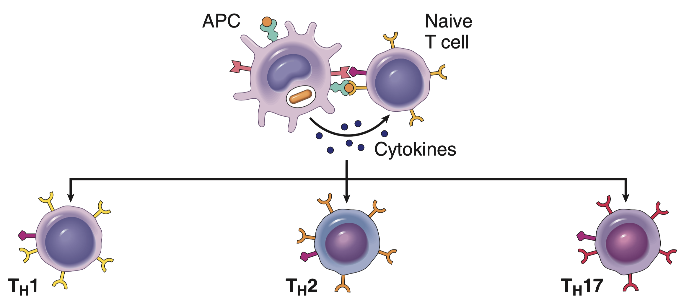
Similarly, biological systems tends to function based on threshold responses. These are like all-or-nothing switches. A response only occurs after a certain level of stimulus is reached. In the immune system, this might mean that a certain concentration of antigen is required to trigger T cell activation. It’s not a gradual increase in activation; it’s a sudden jump (Joglekar and Li 2021).
Trying to model these non-linear phenomena with simple straight lines (like in basic linear regression) is like trying to describe a roller coaster ride with a ruler, you’d miss all the exciting ups and downs, the twists and turns. It just doesn’t work. We need models that can capture these non-linear relationships, models that can bend and curve to fit complex biological systems. That’s where the Hill function and logistic growth equations come into play (Li et al. 2023), they’re our tools for capturing these essential curves in our cellular stories.
Simulating Cellular Mayhem
Digital Petri Dishes and Tiny Cellular Actors
This is where agent-based modeling (ABM) swoops in like a superhero. ABM lets us create a virtual world filled with individual “agents”, but in our case, these actors are lymphocytes. Each agent gets its own set of rules, like a tiny cellular script to follow, dictating how it behaves and reacts to its environment (Azarov et al. 2019).
ABMs offer a powerful tool for studying lymphocyte dynamics, allowing us to explore how factors like clonal expansion, contraction, and differentiation are influenced by antigen exposure and immune system regulation (An et al. 2021).
The fun part is that we can then sit back and watch the cellular drama unfold, observing how these agents interact with each other and their digital surroundings over time (just like a movie!). It’s something like building a digital petri dish, a virtual stage where we can run experiments that would be impossible (given monetary or ethical reasons), or just plain messy to perform in real life.
The real beauty of ABM, in comparison to traditional modeling approaches, lies in its ability to:
Account for heterogeneity. Not all lymphocytes are exact copies of each other. They come in different flavors, with different functions, activation states, and responses to stimuli. By simulating virtual cells, we can represent this cellular diversity, giving each cell its own unique personality (or at least its own set of parameters).
Simulate stochasticity. Biology is inherently noisy. Random events, chance encounters, and unpredictable fluctuations can play a significant role in immune responses. ABM allows us to incorporate this randomness, making our simulations much more realistic.
Model inter-individual interactions. We can define rules (as complicate as we want them to be) that determines how lymphocytes interact with each other, with other cell types (like antigen-presenting cells or tumor cells), and with signaling molecules (like cytokines, the cellular equivalent of social media posts). We can simulate complex communication networks, feedback loops, and other intricate interactions that drive immune responses.
And what’s absolutely essential for making these interactions realistic to the one of biological systems? You guessed it: non-linear equations. They allow us to define those complex biological processes with far greater accuracy than simple linear relationships ever could. It’s like using a finely tuned paintbrush to capture the subtle shades of a sunset, rather than just using a single, broad stroke of color.

R as a Tool for Immunological Simulation
R, the beloved language of statisticians, data scientists, and now immunologists (at least for this blog post!), is the perfect tool for building these ABM simulations. It’s powerful, flexible, and comes with a treasure of packages specifically designed for statistical computing, simulation, and data visualization. Plus, it’s open-source, which means it’s free (always a welcome bonus), especially if you’re on a student budget or just like free stuff. With powerful visualization packages like ggplot2, we can create stunningly beautiful and informative visualizations of our simulation results, transforming raw data into compelling stories that are easy to understand. It’s like turning a jumbled mess of numbers into a captivating infographic.
In this post, we’ll swim in oceans of lymphocyte dynamics by building a simplified ABM simulation in R. We’ll harness the power of non-linear equations to model key processes like lymphocyte activation, proliferation, and apoptosis. We’ll start with simple, easy-to-digest examples and gradually add more complexity, showing you step-by-step how to implement these models in R and, crucially, how to interpret the results. By the end of this post, you’ll have a solid understanding of how ABM, combined with the magic of non-linear equations, can provide valuable insights into the inner workings of the immune system. Think of it as a crash course in digital immunology, minus the lab coats, the pipettes, and the actual petri dishes (but with plenty of code, insightful explanations, and, of course, some cool plots!).
From Code to Cellular Chaos
Now that we’ve established why we need to go beyond simple linear models to understand the immune system’s intricate dance, let’s get our hands dirty with some code and build our own lymphocyte simulation in R. Don’t worry if you’re not an immunologist; we’ll keep the biology simple and focus on the modeling aspects.
Setting the Stage for Cellular Action
Our model will focus on a simplified scenario involving T lymphocytes (a type of white blood cell crucial for adaptive immunity). We’ll consider two main types of T cells:
- Naive T cells: These are the rookies of the immune system, waiting for their marching orders. They haven’t encountered their specific target (an antigen) yet.
- Activated T cells: These are the seasoned warriors, ready to fight after being activated by encountering their specific antigen.
We’ll also include a representation of the antigen, which is any substance that can trigger an immune response (like a piece of a virus or a bacterial protein). We won’t explicitly model other cell types (like antigen-presenting cells) in this simplified version, but we’ll account for their role in the activation process.
The Rules of Engagement: From Intuition to Equations
Here’s where the magic of non-linearity comes in. We’ll use a few key equations to dictate the behavior of our T cell agents.
The activation of a naive T cell upon encountering an antigen isn’t a simple binary event; it’s not just “on” or “off,” like a light switch. Instead, it’s a graded response, much like a dimmer switch. The more antigen a T cell encounters, the higher the chance it gets activated (Joglekar and Li 2021). But this increase in activation probability isn’t perfectly linear. There’s often a threshold effect: at low antigen concentrations, not much happens, but above a certain concentration, the activation probability shoots up dramatically. This “switch-like” behavior is what equations used in biochemistry like the Hill function elegantly captures.
Activation Function: The “On” Switch
Let’s build up the intuition behind this function. Imagine a T cell receptor (TCR) on the surface of a T cell. For simplicity, let’s consider that the interaction of the TCR with the antigen is a complex process that can involve multiple steps and interactions (Dushek et al. 2011). While we might imagine that \(n\) antigen molecules are required to bind for full activation, the Hill equation doesn’t directly represent this exact number of binding sites. Instead, it describes the overall cooperativity of the binding process (Stefan and Le Novère 2013).
Now, let’s think about the probability of activation as a function of antigen concentration. If the antigen concentration is low, the probability of any productive interaction between the antigen and TCR is low, and therefore, the probability of activation is also low. As the antigen concentration increases, the probability of productive interactions also increases. This increase is often non-linear, with a steeper rise at certain concentrations (Dushek et al. 2011). This non-linearity is captured by the concept of cooperativity: the binding of one antigen molecule can influence the likelihood of subsequent binding events or downstream signaling events, leading to a more pronounced response.
This intuition leads us to the Hill function:
\[ \Pr(\text{Activation}) = \frac{\text{[Antigen]}^n}{K^n + \text{[Antigen]}^n} \]
Let’s break down this equation piece by piece, connecting it to our intuitive understanding:
\(\Pr(\text{Activation})\) is the probability that a naive T cell becomes activated. It ranges from 0 (no activation) to 1 (certain activation).
\(\text{[Antigen]}\) represents the concentration of the antigen. The more antigen present, the higher the chance of binding and activation.
\(n\) is the Hill coefficient. It is a phenomenological parameter that describes the steepness or cooperativity of the response. A higher \(n\) indicates a steeper curve and a more switch-like response. It reflects how much the binding of one antigen influences the binding of subsequent antigens or the downstream signaling events.
\(K\) is the dissociation constant. It represents the antigen concentration at which the probability of activation is 50%. It’s a measure of the affinity between the antigen and the TCR. A smaller \(K\) means a higher affinity (stronger binding), meaning that less antigen is needed to achieve 50% activation. You can think of \(K\) as the “difficulty” of binding, a smaller \(K\) means it’s easier to bind.
How Does this Equation Capture the Switch-Like Behavior?
Okay but, how does this equation capture the switch-like behavior? Let’s see how:
- At very low antigen concentrations (\(\text{[Antigen]} << K\)), the term \(\text{[Antigen]}^n\) is much smaller than \(K^n\), so the probability of activation is close to zero.
- At very high antigen concentrations (\(\text{[Antigen]} >> K\)), the term \(\text{[Antigen]}^n\) dominates, and the probability of activation approaches 1.
The transition between these two extremes is sharper when \(n\) is larger. This steep transition is what we refer to as the “switch-like” behavior.
It’s crucial to understand that \(n\) is an effective or apparent cooperativity coefficient. It describes the overall cooperativity of the binding process, which can be influenced by multiple factors beyond just the number of binding sites. It can reflect complex downstream signaling events or allosteric effects.
Here’s the R function:
This R function is a direct translation of the Hill equation. It takes the antigen concentration (antigen), the dissociation constant (K), and the Hill coefficient (n) as inputs and returns the calculated activation probability. It’s our little digital “activation calculator.”
And a quick visualization to show the effect of the Hill coefficient:
Code
antigen_conc <- seq(0, 2, by = 0.001)

df <- lapply(c("0.2" = 0.2, "0.5" = 0.5,
         "1.0" = 1.0, "2.0" = 2.0,
         "4.0" = 4.0), function(x) {
           data.table(
             Pr = activation_probability(antigen_conc, K = 0.7, n = x),
             Antigen = antigen_conc
           )
         }) |> rbindlist(idcol = "Hill coefficient")

ggplot(df, aes(Antigen, Pr)) +
  geom_line(aes(color = `Hill coefficient`), linewidth = 1) +
  labs(x = "Antigen Concentration", y = "Probability of Activation", color = "Hill Coefficient", title = "Effect of Hill Coefficient on Activation Probability") +
scale_color_ordinal()n) on T cell activation. When n = 1, the response is nearly linear. However, as n increases (n = 2, n = 4), the activation curve becomes increasingly steep, demonstrating enhanced cooperativity and a more pronounced threshold effect. This highlights how small changes in antigen concentration can trigger large changes in activation probability when cooperativity is high. It’s like comparing a gentle slope to a cliff, a small step can make a big difference when you’re near the edge of the cliff (high n).Proliferation: The Population Explosion
Once a T cell is activated, it’s time for action (and lots of it). This action comes in the form of proliferation, where a single activated T cell divides and creates many identical copies of itself, building an army to fight the infection (Kumar, Abbas, and Aster 2012). If there were no limits, this growth would be exponential (like compound interest in a bank account), but with cells instead of money. Imagine starting with one cell, and it doubles every hour. After just a day, you’d have millions!
But, of course, in the real world (and even in our digital one), such unrestrained growth is impossible. There are limited resources: space, nutrients, signaling molecules, all the things a T cell needs to survive and multiply. Eventually, the growth must slow down and plateau. This is where the logistic growth equation comes in, providing a much more realistic model of population dynamics.
Let’s start with the continuous form of the logistic growth equation:
\[ \frac{dN}{dt} = rN \left(1- \frac{N}{K}\right) \]
Let’s break down this equation and connect it to our intuitive understanding of population growth:
- \(\frac{\partial N}{\partial t}\): This term represents the rate of change in the number of T cells (\(N\)) over time (\(t\)). It’s how quickly the population is growing or shrinking. Think of it as the “speedometer” of our population.
- \(r\): This is the intrinsic growth rate, sometimes called the per capita growth rate. It represents how quickly the population would grow if there were no limitations. It’s the “ideal” growth rate, like the speed limit on a highway.
- \(N\): This represents the current number of T cells. It’s the current “position” of our population.
- \(K\): This is the carrying capacity. It represents the maximum number of T cells that the environment can sustain. It’s the “maximum occupancy” of our battlefield, there’s only so much room for T cells to operate.
Now, let’s see how this equation captures the idea of limited growth.
At low population densities (N << K), when the number of T cells (\(N\)) is much smaller than the carrying capacity (\(K\)), the term \((1 - \frac{N}{K})\) is close to 1. The equation then simplifies to \(\frac{\partial N}{\partial t} = rN\), which is the equation for exponential growth. This makes sense: when there are plenty of resources and space, the population grows rapidly, like those initial rabbits in a wide open field.
At high population densities (N ≈ K), as the number of T cells (\(N\)) approaches the carrying capacity (\(K\)), the term \((1 - \frac{N}{K})\) approaches 0. This causes the rate of change \(\frac{\partial N}{\partial t}\) to also approach 0, meaning the population growth slows down and eventually stops. This also makes sense, given that as the battlefield becomes crowded, resources become scarce, and the T cell population can’t grow much more.
Since our simulation is discrete-time (we update the population at specific intervals, not continuously), we use a discrete-time approximation of the logistic growth equation:
\[ N(t+1) = N(t) + r * N(t) * \left(1 - \frac{N(t)}{K} \right) \]
This equation tells us how to calculate the number of T cells at the next time step (\(N(t+1)\)) based on the current number of T cells (\(N(t)\)), the growth rate (\(r\)), and the carrying capacity (\(K\)). It’s like taking snapshots of the population at regular intervals and updating the numbers based on the growth equation.
Here’s the R function that implements this discrete-time approximation:
proliferation <- function(N, r, K) {
  N + r * N * (1 - N / K)
}
This R function takes N, r, and K as inputs and returns the updated number of T cells. It’s our digital “population updater,” simulating the growth and eventual stabilization of the T cell army.
And here’s a visualization of the proliferation behavior of our function implementation:
Code
## Function to simulate cell proliferation
proliferating_cells <- function(n_steps, n_cells, r, k) {
  cells <- numeric(n_steps)
  cells[1L] <- n_cells
  for (t in 2:n_steps) {
    cells[t] <- proliferation(N = cells[t-1], r = r, K = k)
  }
  data.table(Time = seq_len(n_steps), Cells = cells)
}

## Testing different Rate values
df <- lapply(X = seq(0.1, 0.6, by = 0.1), function(x) {
  proliferating_cells(100, 1, x, 200)
}) |> rbindlist(idcol = "Rate")

## Pretty labels for plotting
df[, Rate := ordered(Rate, levels = 1:6, labels = seq(0.1, 0.6, by = 0.1))]

## ggplot2 plot
ggplot(df, aes(Time, Cells, color = Rate)) +
  geom_hline(yintercept = c(0, 200), color = "gray50",
             linewidth = 1/2, linetype = 2) +
  geom_line(linewidth = 1) +
  labs(x = "Time Steps",
       y = "Number of Cells",
title = "Simulation of Cell Proliferation over Time")Apoptosis (Constant Probability): The Programmed Exit
Even the most valiant soldiers can’t fight forever. T cells, like all living cells, have a finite lifespan. They eventually undergo apoptosis, a process of programmed cell death. It’s like a built-in self-destruct mechanism that ensures cells don’t become a burden or pose a risk to the organism. In our model, we’ll represent apoptosis with a constant probability. This means that at each time step, every activated T cell has the same chance of undergoing apoptosis, regardless of how long it’s been activated or what it’s been doing.
Let’s represent this with a simple equation:
\[ \Pr(\text{apoptosis}) = p_{\text{apoptosis}} \]
This equation is pretty straightforward:
- \(\Pr(\text{apoptosis})\): This represents the probability that a single activated T cell will undergo apoptosis during a given time step. It’s a number between 0 (no chance of apoptosis) and 1 (certain apoptosis).
- \(p_{\text{apoptosis}}\): This is the constant probability of apoptosis. It’s a parameter of our model that we can set to represent different rates of cell death.
This constant probability model assumes that apoptosis is a random event that occurs independently for each cell (which is a simplication of real-life biological systems). It’s like each cell flipping a weighted coin at every time step. If the coin lands on “heads” (with a probability of \(p_{\text{apoptosis}}\)), the cell undergoes apoptosis.
Now, let’s translate this into R code:
apoptosis <- function(N, p_apoptosis) {
  n_apoptosis <- rbinom(1, N, p_apoptosis) # Number of cells undergoing apoptosis
  N - n_apoptosis
}
This function simulates apoptosis. It takes two arguments: N (the current number of T cells) and p_apoptosis (the probability of apoptosis). It uses rbinom(1, N, p_apoptosis) to generate a random number of cells that undergo apoptosis. rbinom() simulates a binomial distribution, which is perfect for modeling the number of “successes” (apoptosis events) in a given number of “trials” (cells). It’s like rolling a bunch of dice, where each die has a probability p_apoptosis of landing on “apoptosis”. The function then returns the remaining number of cells after apoptosis.
And here’s a visualization simulating the effect of different p_apoptosis values on the total number of cells over time:
Code
## Function to simulate cell dead
apoptotic_cells <- function(n_steps, n_cells, p) {
  cells <- numeric(n_steps)
  cells[1L] <- n_cells
  for (t in 2:n_steps) {
    cells[t] <- apoptosis(N = cells[t-1], p_apoptosis = p)
  }
  data.table(Time = seq_len(n_steps), Cells = cells)
}

## Testing different Rate values
df <- lapply(X = seq(0.1, 0.5, by = 0.1), function(x) {
  apoptotic_cells(50, 1000, x)
}) |> rbindlist(idcol = "Probability")

## Pretty labels for plotting
df[, Probability := ordered(Probability, levels = 1:5, labels = seq(0.1, 0.5, by = 0.1))]

## ggplot2 plot
ggplot(df, aes(Time, Cells, color = Probability)) +
  geom_hline(yintercept = c(0), color = "gray50",
             linewidth = 1/2, linetype = 2) +
  geom_line(linewidth = 1) +
  labs(x = "Time Steps",
       y = "Number of Cells",
       title = "Simulation of Cell Apoptosis over Time",
color = expression(P[Apoptosis]))p_apoptosis), the faster the sandcastle disappears.Setting Up the Simulation
Before we launch our digital immune response, we need to set the stage. This means defining the initial conditions and parameters for our simulation. Think of it as setting up a virtual battlefield where our T cells will fight their digital battles.
## T Cell population
n_steps <- 100         # Number of time steps
n_naive <- 100         # Initial number of naive T cells

## T Cell activation function
antigen_level <- 0.2   # Antigen concentration
K_activation <- 0.5    # Dissociation constant for activation
n_hill <- 3            # Hill coefficient for activation
Here’s what we’re setting up:
n_steps: This is the number of time steps our simulation will run for. Think of it as the duration of the battle. We’ve chosen 100 time steps, but you can adjust this to simulate longer or shorter periods.n_naive: This is the initial number of naive T cells we start with. These are our fresh recruits, eager to join the fight. We’re starting with 100 naive T cells.antigen_level: This is the concentration of the antigen, the enemy our T cells are fighting against. It’s like the strength of the enemy army. We’ve set it to 0.2, but you can change this to simulate different infection scenarios.K_activation: This is the dissociation constant for activation, a parameter of the Hill function. Remember, this determines how strongly the antigen binds to the T cell receptor.n_hill: This is the Hill coefficient, which controls the steepness of the activation curve. A higher n_hill means a more switch-like response.
These parameters are like the initial settings of our simulation, determining the starting conditions of our virtual immune response.
Simulating Activation and Early Response: Lighting the Fire
Now that we have our equations and R functions ready, let’s simulate the initial activation of naive T cells in response to antigen. This section will focus on the early stages of the immune response, where naive T cells are first encountering the antigen and transitioning into their activated state. It’s like the first spark that ignites the immune fire, turning our rookie T cells into seasoned warriors.
To simulate the activation and early response of T cells, we will implement the following function:
## Simulation function
sim_t_activation <- function(n_steps, n_naive, antigen_level, K_activation, n_hill) {
  # Initialize data structures
  naive_t_cells <- numeric(n_steps)
  activated_t_cells <- numeric(n_steps)

  # Initial number of naive T cells
  naive_t_cells[1L] <- n_naive

  ## Probability of activation
  prob <- activation_probability(antigen_level, K_activation, n_hill)

  # Loop of activation cycle
  for (t in 2:n_steps) {
    # Probabilistic Activation of T cells
    n_activated <- 0
    n_activated <- sum(runif(n = naive_t_cells[t-1]) < prob)

    ## Update population of T cells
    naive_t_cells[t] <- naive_t_cells[t-1] - n_activated
    activated_t_cells[t] <- activated_t_cells[t-1] + n_activated
  }

  # Preparing the data from the simulation
  df <- data.table(Time = seq_len(n_steps),
                   Naive = naive_t_cells,
                   Activated = activated_t_cells)

  # In long format
  melt(df, id.vars = "Time")
}
Let’s break down what’s happening inside this function:
Initializing Data Structures:
naive_t_cells <- numeric(n_steps)andactivated_t_cells <- numeric(n_steps)create empty vectors to store the number of naive and activated T cells at each time step. It’s like setting up empty scoreboards to track the progress of the battle.Setting Initial Conditions:
naive_t_cells[1L] <- n_naivesets the initial number of naive T cells at the beginning of the simulation (time step 1). This is where we deploy our initial batch of rookie T cells onto the battlefield.Calculating Activation Probability:
prob <- activation_probability(antigen_level, K_activation, n_hill)calculates the probability of activation using our previously defined Hill function. This is like assessing the likelihood of our T cells encountering and recognizing the enemy.The Activation Loop (The Battle Begins!): The
for (t in 2:n_steps)loop simulates the passage of time, with each iteration representing a time step. Inside this loop, we have:- Probabilistic Activation:
n_activated <- sum(runif(n = naive_t_cells[t-1]) < prob)is where the magic of stochastic activation happens. For each naive T cell at the previous time step, we generate a random number between 0 and 1 usingrunif(). If this random number is less than the calculated activation probability (prob), the T cell is considered activated. It’s like each T cell flipping a weighted coin – the higher the probability, the more likely they are to “win” and become activated. Thesum()function counts how many T cells were activated in this time step. - Updating Cell Populations:
naive_t_cells[t] <- naive_t_cells[t-1] - n_activatedandactivated_t_cells[t] <- activated_t_cells[t-1] + n_activatedupdate the number of naive and activated T cells. The number of naive T cells decreases as they become activated, and the number of activated T cells increases accordingly. It’s like tracking the casualties and new recruits on both sides of the battle.
- Probabilistic Activation:
Preparing Data for Plotting: The code then prepares the simulation results into a data frame suitable for plotting using
data.tableandmelt.
Now, let’s visualize the results:
Code
df <- sim_t_activation(n_steps, n_naive, antigen_level, K_activation, n_hill)

ggplot(df, aes(x = Time, y = value, color = variable)) +
  geom_line(linewidth = 1) +
labs(title = "Early T Cell Activation Response", x = "Time Steps", y = "Number of Cells", color = "Cell Type")Simulating Proliferation and Population Dynamics: The Army Grows
Now that we have some activated T cells itching for action, let’s simulate their proliferation, the process where they multiply like, well, like very enthusiastic cells. We’ll extend our simulation and incorporate the logistic growth equation to keep things realistic (no infinite armies here!).
First, let’s define some parameters that control the proliferation dynamics:
## T Cell Proliferation and Apoptosis
r_proliferation <- 0.1 # Proliferation rate
K_carrying <- 150 # Carrying capacityr_proliferation: This is the proliferation rate, which determines how quickly the activated T cell population grows. It’s like the “birth rate” of our T cell army. A higher r_proliferation means faster growth.K_carrying: This is the carrying capacity, which represents the maximum number of activated T cells that the environment can support. It’s like the size of the battlefield, there’s only so much space and resources available.
Let’s visualize the results:
Code
df <- sim_t_activation(n_steps, n_naive, antigen_level, K_activation, n_hill, r_proliferation, K_carrying)

ggplot(df, aes(x = Time, y = value, color = variable)) +
  geom_line(linewidth = 1) +
labs(title = "T Cell Activation and Proliferation", x = "Time Steps", y = "Number of Cells", color = "Cell Type")K = 150), demonstrating resource limitation. It’s like a population of rabbits in a field, they multiply quickly at first, but eventually, they run out of space and resources, and the population stabilizes.Combining Processes: A Full Simulation
Now, the moment we’ve all been waiting for! Let’s combine all the processes we’ve discussed (activation, proliferation, and apoptosis) into a single, more complete simulation. This will give us a more realistic picture of how T cell populations behave during an immune response.
We’ll also make a couple of tweaks: we’ll set the apoptosis probability to 10% at each time step and increase our initial number of naive T cells to 300 and a carrying capacity of 500, because a bigger army is always more fun to simulate.
And the final visualization:
Code
## Parameters
p_apoptosis = 0.1 # Probability of apoptosis
n_naive = 300 # Number of initial naive T cells
K_carrying = 500 # Carrying capacity
r_proliferation = 0.5 # Proliferation rate

# Simulation loop with activation, proliferation, and apoptosis
df <- sim_t_activation(n_steps, n_naive, antigen_level, K_activation, n_hill, r_proliferation, K_carrying, p_apoptosis)

# Plot the full simulation
ggplot(df, aes(x = Time, y = value, color = variable)) +
  geom_line(linewidth = 1) +
labs(title = "Full T Cell Dynamics: Activation, Proliferation, and Apoptosis", x = "Time Steps", y = "Number of Cells", color = "Cell Type")What Happens if We Tweak the Knobs?
A crucial step in any modeling study is sensitivity analysis. It’s like playing with the knobs and dials of your model to see how it responds. We want to understand how changes in our input parameters (like the Hill coefficient or the carrying capacity) affect the outputs of our simulation (like the number of activated T cells). This helps us identify which parameters have the biggest influence on the model’s behavior, which knobs are the most important to turn if we want to change the outcome.
For instance, we can show a quick example of sensitivity analysis by varying the Hill coefficient (\(n\)), which, as we know, controls how switch-like the activation is:
Code
# Sensitivity analysis for Hill coefficient
n_hill <- c("n = 1" = 1, "n = 2" = 2, "n = 3" = 3, "n = 4" = 4)
df <- lapply(n_hill, function(x) {
  sim_t_activation(n_steps = 100, n_naive = 300,
                   antigen_level = 10, K_activation = 25, n_hill = x,
                   r_proliferation = 0.5, K_carrying = 500, p_apoptosis = 0.10)
}) |> rbindlist(idcol = "n_hill")

ggplot(df, aes(x = Time, y = value, color = variable)) +
    geom_line(aes(alpha = ordered(n_hill)), linewidth = 1) +
    labs(title = "Sensitivity Analysis for Hill Coefficient",
         x = "Time Steps",
         y = "Number of Activated Cells",
         color = "Carrying Capacity",
         alpha = "Hill Coefficient",
         caption = "With [Antigen] = 10, and K = 25") +
theme(plot.caption = element_text(size = 12))Here’s a closer look at what’s going on behind the scenes of this code.
The resulting plot is where we see the fruits of our labor. It shows how the dynamics of the activated T cell population and the recruitment of naive T cells change depending on the Hill coefficient. Tipically, higher values of \(n\) lead to a more rapid and pronounced increase in activated T cells. However, this is only true when \(\text{[Antigen]}\) are above the \(K\) threshold.
In this case this relationship is inverted (recall the plot of the hill function we saw earlier), which might seem counterintuitive at first, but remember that the Hill coefficient affects the steepness of the activation curve. A higher Hill coefficient is like a very sharp switch, a small increase in antigen concentration leads to a big jump in activation after the \(K\) threshold is surpassed. Conversely, a lower Hill coefficient is like a more gradual dimmer switch.
This sensitivity analysis is incredibly valuable because it helps us understand just how important are the parameters in the equation controlling how T cells get activated. It shows that this parameter can significantly impact the overall immune response. By playing with these parameters, we can get a much better feel for how the immune system works and how it might react to different challenges, it’s like fine-tuning an instrument to get the perfect sound.
So, What Did Our Digital Cells Actually Do?
Now that we’ve unleashed our digital immune system and watched our simulated lymphocytes playing out in the digital petri dish, let’s take a step back and figure out what it all means. Did we just waste a bunch of CPU cycles, or did we actually learn something?
Biological Interpretation and Relevance: Decoding the Digital Chatter
Our simplified model, while admittedly a bit of a caricature of the real thing, manages to capture some fundamental aspects of how lymphocytes behave.
The Hill function for activation, that fancy equation with the exponents, perfectly illustrates the importance of cooperative binding and threshold responses in kicking off an immune response (Dushek et al. 2011; Stefan and Le Novère 2013). It’s like a party, one person arriving might not start a dance floor, but once a few more join in, suddenly everyone’s grooving. That’s cooperativity!
The logistic growth equation, our population-limiting equation, shows how limited resources (like space, food, and Wi-Fi in the body) put a limit on lymphocyte proliferation, preventing them from turning into an unstoppable, resource-devouring horde (Morris, Farber, and Yates 2019; Jin, McCue, and Simpson 2018). The addition of stochasticity (randomness), that sprinkle of randomness we added, is a reminder that biological systems are inherently noisy. Even with identical starting conditions, the outcome of a real immune response can vary, it’s like two identical twins might react differently to the same flu virus.
For example, let’s consider what happens when we change the antigen level. In our simulation, a higher antigen concentration (more enemies on the battlefield) leads to a faster and stronger activation of T cells. This, in turn, drives a larger proliferative response (up to the carrying capacity, the maximum number of T cells the body can support). This makes perfect sense biologically: a larger invasion requires a larger counterattack. It’s like sending in more troops when facing a bigger enemy army. Similarly, the Hill coefficient (\(n\)) plays a crucial role. A higher Hill coefficient implies a more sensitive response to changes in antigen concentration. It’s like having a hair-trigger alarm, a tiny change in antigen concentration sets off a massive response from the T cells.
Now, let’s bring this back to our initial motivation: cancer immunotherapy. Our model suggests that the effectiveness of checkpoint blockade therapies (which unleash the immune system against cancer cells) might depend not only on the number of T cells hanging around in the tumor but also on factors like the local antigen concentration (how recognizable the cancer cells are) and the sensitivity of T cells to that antigen (represented by our Hill coefficient). So, it’s not just about having enough soldiers; it’s also about making sure they can see and react to the enemy properly.

Where Our Digital Cells Fall Short
It’s crucial to acknowledge the limitations of our simplified model. We’ve made some necessary simplifications to make it manageable for this post (and to prevent my computer from melting down). Think of it as drawing a cartoon of a person, it captures the basic idea, but it’s not a photorealistic portrait.
Simplified cell types. We’ve only considered two types of T cells (naive and activated), which is a gross oversimplification. The real immune system has a whole alphabet soup of immune cells (B cells, dendritic cells, regulatory T cells, and many more), each with its own specialized role. Incorporating more cell types would allow us to model more complex interactions and immune responses, like teamwork between different parts of the immune system.
No spatial dynamics. Our model doesn’t account for the spatial organization of the immune system. In reality, immune cells move around the body, interacting in specific locations like lymph nodes or tissues. Modeling the movement of cells within tissues would add another layer of realism.
Simplified interactions. We’ve only modeled a few key processes (activation, proliferation, apoptosis). In reality, there are countless interactions between immune cells, including cytokine signaling (chemical messages between cells) and direct cell-cell contact. Modeling cytokine networks and other signaling molecules would allow us to simulate more complex feedback loops and interactions.
Constant parameters. We’ve assumed that parameters like the growth rate and apoptosis probability are constant over time. In reality, these parameters can change depending on various factors in the cell’s environment. Modeling these parameters as dependent on the cell environment would allow us to simulate more realistic biological scenarios.
These simplifications are necessary for a blog post (and to avoid a complete descent into computational madness), but they mean our model doesn’t capture the full complexity of the real immune system. More complex models, incorporating these missing elements, could be used to address a wider range of immunological questions, from predicting vaccine efficacy to designing personalized immunotherapies.
From Pixels to Patients
In this post, we’ve taken a wild tour around the topic of agent-based modeling and non-linear equations in R, showing how they can be used to simulate the dynamic world of lymphocyte populations. We’ve built a simplified model that captures key processes like activation, proliferation, and apoptosis, and we’ve seen how these processes interact to shape the overall immune response.
While our model is a simplified representation of reality (a digital doodle compared to a biological masterpiece), it provides a valuable framework for understanding the fundamental principles of lymphocyte dynamics. It demonstrates the power of computational modeling in immunology, offering a way to explore complex biological systems in a way that would be difficult or impossible with traditional experimental methods alone. By building these digital models, we can gain insights that could eventually lead to more effective treatments and interventions for a wide range of diseases, bringing us closer to a future where digital cells translate into real-world impact for patients.
References
Citation
@misc{castillo-aguilar2024,
  author = {Castillo-Aguilar, Matías},
  title = {Modeling {Lymphocyte} {Dynamics:} {Agent-Based} {Simulations}
    and {Non-Linear} {Equations}},
  date = {2024-12-23},
  url = {https://bayesically-speaking.com/posts/2024-12-23 modeling-lymphocyte-dynamics/},
  doi = {10.59350/aqa1r-e2v59},
  langid = {en}
}